Newsprint is a highly-economical non-archival paper that best-known for its widespread use by news publishers, high-frequency magazines, classified publications, handbooks, phone books, textbooks, journals, guides, manuals and a variety of other common print products. Despite the recent decline in print publishers, newsprint is still widely used in many modern print applications.
In today’s post, we’ll be going over some basic tips for designing on newsprint, and why they are important for newspaper printing, or any other kind of print that uses newsprint paper.
1. Understand Color Gamut

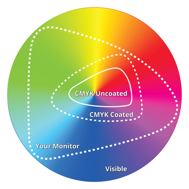
Color Gamut is the entire range of reproducible colors by any media or device. Paper, printers, presses and your monitor all have limits to the range of colors they can reproduce. This is that device or media’s Color Gamut.
Newsprint is a highly-porous, uncoated paper consisting primarily of wood pulp. Because of this, the color gamut for newsprint is very narrow — a bit less than coated paper, and significantly less than your computer monitor. To get an idea of the difference, have a look at my (very non-scientific) graph above. Imagining that the circle is the entire spectrum of visible colors, the inner-most graph would be the gamut for newsprint. Now compare this to coated paper. Neither come close to the gamut of your monitor, which is important to keep in mind when designing for print using a computer screen.
2. Less Ink = Better Color
You will never be able to reproduce all the colors available on your screen on any paper, and even less colors will be available to you on newsprint. For this reason, it’s important that you not try to saturate your colors too much. Instead, use color combinations that use no more than 2-3 of the four CMYK inks. There’s a reason why yellow and red are such popular colors on newsprint: red is two inks (yellow & magenta), and yellow is one ink.
Watch your coverage. You should never go over 260% coverage if you can help it, and honestly I think even that is way too much (e.g. 100% Cyan + 100% Magenta + 60% Black = 260% coverage).
Less ink will result in better, brighter colors.
Read More at https://www.caseyprinting.com/blog/5-tips-for-designing-on-newsprint

